
In every web application we required tabular data and lists most of the time data can be represented in form of tables and lists. So that I decided to design and build a responsive tables and lists using bootstrap 3 without having designing knowledge we can easily create using bootstrap special classes. We can run these tables and lists example from small mobile screen to big desktop screen it is completely responsive changes according to device width.
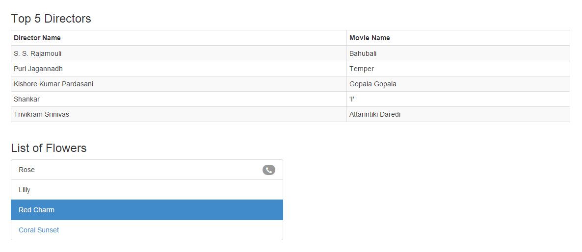
In our example we have created un-ordered list with some information and table that represents the top list of directors along with movie name.

<!DOCTYPE html>
<html lang="en">
<head>
  <meta charset="utf-8" />
  <meta name="viewport" content="width=device-width, initial-scale=1.0">
  <title>Bootstrap 3 Responsive Tables and Lists</title>
  <link rel="stylesheet" href="css/bootstrap.min.css">
</head>
<body style="margin-top: 70px;">
  <div>
    <section  class="container">
 <h3>Top 5 Directors</h3>
      <div class="row">
        <div class="col-md-12">
          <div class="table-responsive">
            <table class="table table-striped table-bordered table-hover table-condensed">
              <thead>
                <tr>
                  <th>Director Name</th>
                  <th>Movie Name</th>
                </tr>
              </thead>
              <tr>
                <td>S. S. Rajamouli</td>
                <td>Bahubali</td>
              </tr>
              <tr>
                <td>Puri Jagannadh</td>
                <td>Temper</td>
              </tr>
              <tr>
                <td>Kishore Kumar Pardasani</td>
                <td>Gopala Gopala</td>
              </tr>
              <tr>
                <td>Shankar</td>
                <td>'I'</td>
              </tr>
              <tr>
                <td>Trivikram Srinivas</td>
                <td>Attarintiki Daredi</td>
              </tr>
            </table>
          </div>
        </div>
      </div>
      <h3>List of Flowers</h3>
   <div class="row">
        <div class="col-md-6">
          <ul class="list-group">
            <li class="list-group-item">
              <span class="badge">
                <span class="glyphicon glyphicon-earphone"></span>
              </span>
             Rose
            </li>
            <li class="list-group-item">
              Lilly
            </li>
            <li class="list-group-item active">
             Red Charm
            </li>
            <li class="list-group-item">
              <a href=""  target="_blank">Coral Sunset</a>
            </li>
          </ul>
        </div>
      </div>
    </section>
  </div>
  <script src="js/jquery-2.0.3.min.js"></script>
  <script src="js/bootstrap.min.js"></script>
</body>
</html>
0 comments:
Post a Comment